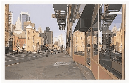
There’s a lot to see where I work, at Market Street between 2nd Street and New Montgomery.
I even wrote about this block on an earlier post: a private eye said it’s the perfect place to lose a tail because there’s so much action.

Thousands of people pass by in an hour – like Frank Chu, who orbits Market Street with his crazy signs. And tons of office workers, tourists, art students, deliverers, and panhandlers. Some strutting and some shuffling.
I’m down there all the time but just last week I realized that the most important landmarks on the block aren’t the heroic statue or the Hobart Building. They are the Guardian and the Concierge. Every day, they’re there like bookends, the Guardian on one corner and the Concierge on the other. Without them the block would seem empty, like a party before the guests arrive or a nightclub during the day.
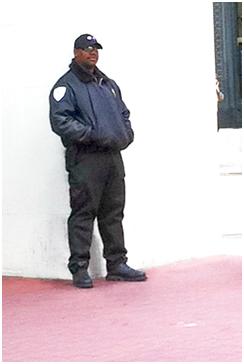
The Guardian.
When the Bank of America is open he stands by the door. I wouldn’t even think of robbing this branch. I’m even afraid to speak to him, with his gun and his sunglasses.

The Concierge
For the eight years I’ve had an office on this corner, he’s been in front every day. On good days he shines shoes and on rainy days he sells umbrellas. At least four times every weekday he’s tried to shame me into a shine – even when I’ve worn brand new shoes. That’s over 7,000 times I’ve heard “Where’s the pride!?” and “We gotta do something about those shoes, Slim!” But I never wanted to sit, like a potentate on Market Street, while getting my shoes shined.
Until last week. He gestured me onto an old movie theatre seat. We introduced ourselves after thousands of days of shoeshine offers and shrugs.
22 years he’s been on the corner, far longer than any of the stores or banks. They come and go but John (that’s his name) has been steady. He anchors the block. Most of his patrons have been coming regularly for years themselves, men mostly, catching up and getting shined. Watching the block change and the world go by.
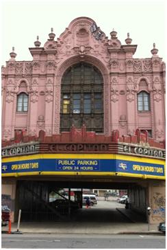
It’s a great corner: it’s got a subway stop and a flower stand and a heroic statue. It’s got a mix of old buildings and new ones. Historic streetcars run by.
Plus, now, every morning I get greeted on arrival; “Hey Dave how’s it goin’?” and greet John back by name, too. The ice has been broken.
When streets get planned and planted and buildings get designed and built it’s easy to forget the pleasure of a welcome. The importance of recognizing where we are and of being recognized back. Of belonging.
This human touch: you can’t buy it or rent it, design it or build it, or fake it. But it you can feel it.


 Population: 6.5 million
 Population: 11 million
 Population: 3 million
 Population: 2.8 million
 Population: 4.16 million
 Population: 3.2 million